Reach out. Let's ideate.
dharani232k@gmail.com
In today's dynamic workplace, effective leave management is paramount for organizational efficiency and employee satisfaction. Our project introduces user-friendly enhancements to simplify and expedite the process for both employees and HR. Expect a hassle-free experience, increased transparency, and improved efficiency, making leave management a breeze.

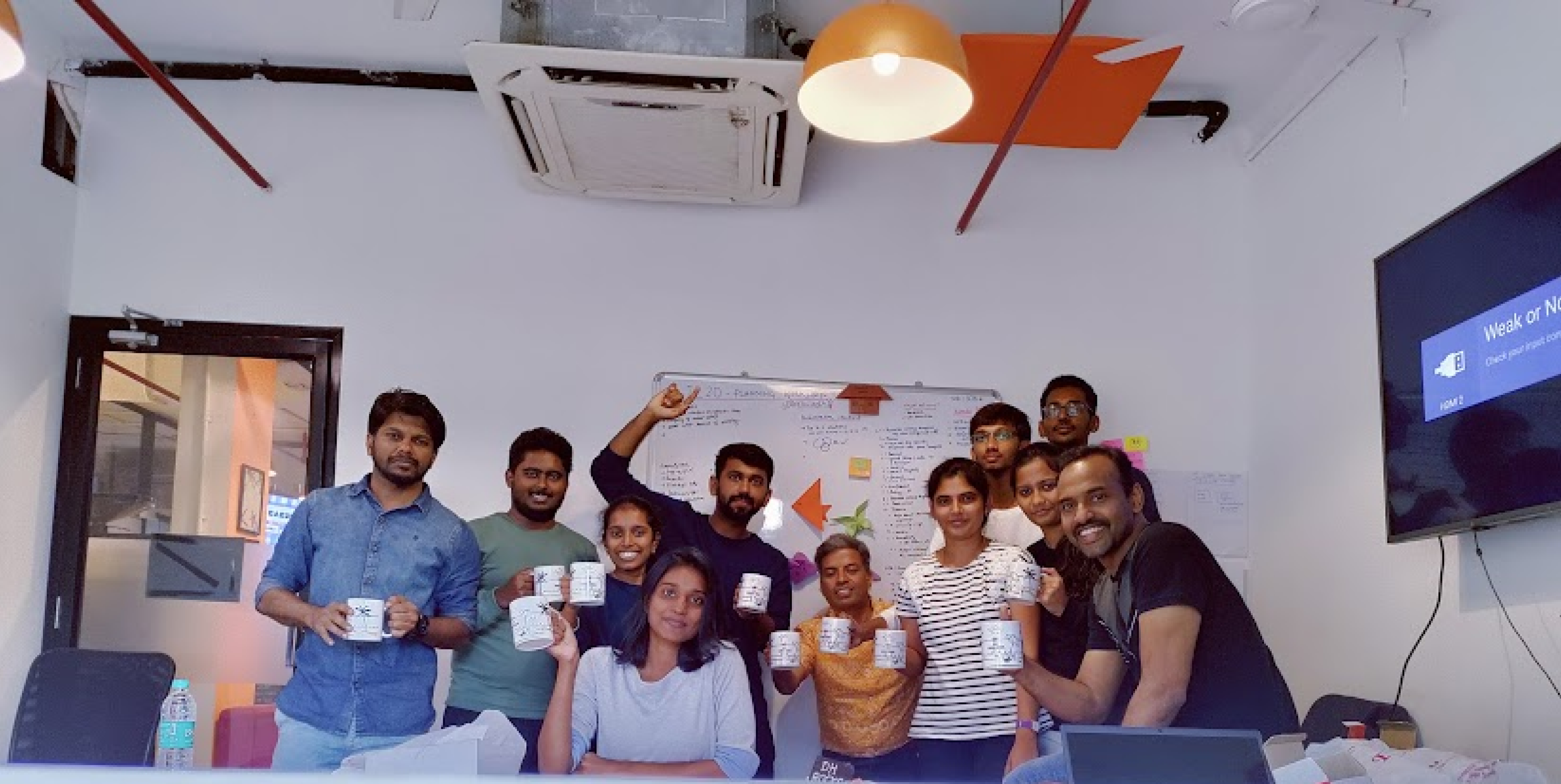
Application Revamp Day
Enhancing the organization members' day-to-day leave application.
Role
UX&UI Designer
Team
3 UX&UI Designer, 1 design lead mentor
Duration
1 Day
I worked as a UI/UX Designer on this project, researching and analyzing on user feedback and working on wireframe options to enhance the features along with a design lead and 2 UX Engineers. This project is a one day activity to collaborate with team and to educate the importance of UX design process among cross teams.
MY ROLE
Focus Point:
1. First time users: Understandable UI
2. Flow of dependent tasks
3. Personalized leave policy & information.

Revamping of internal leave application through a collaborative workshop led by a guest,a design expert from the US. Divided into two teams, we brainstormed and redesigned the app for better user experience. Getting reviewed by external Subject matter expert, offering valuable suggestions. This collaboration highlighted proactive improvement and cross-team synergy.
01 | PROJECT GOALS
02 | PAIN POINTS
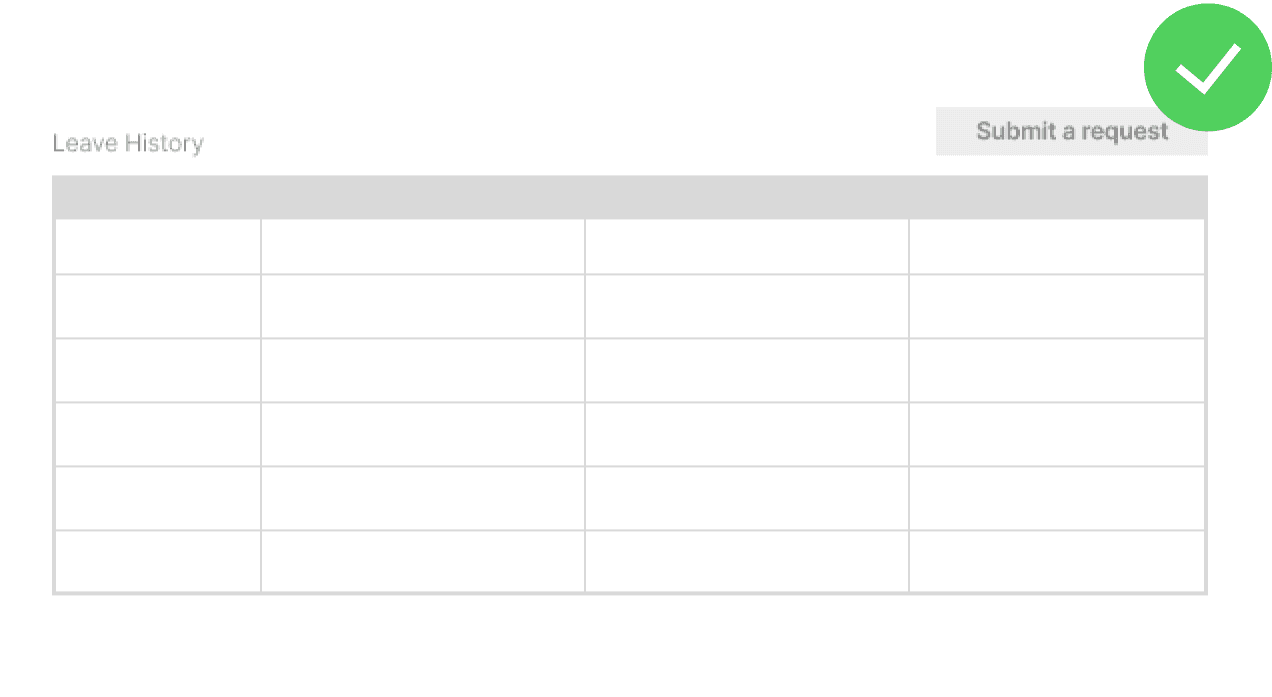
New users don't require the filter option initially.
The filter in the form is receiving more attention than the 'Submit Request' button, causing confusion.
The 'Time Off' heading resembles a small label, leading to user confusion.
Navigation links are absent in the 'Food Info' section.
The option to 'Cancel Request for All Days' is missing.
There's no 'Leave Action' (Completion/Cancellation) page available.
Issues identified with overall responsiveness of the interface.
Lack of clarity upon clicking 'Monthly Leave Details' without scrolling, leaving users uncertain about the outcome.
From user interviews, we identified pain points users encounter when applying for leave.
03 | Heuristic Evaluation of Leave Application
Heuristics
Violation
Recommendation
Severity
1. CTA button can be highlighted
Consistency and Standards
The user can’t see the Submit a Request link easily
A button can be used for this purpose to highlight the option provided for submitting a new request
4
2. RM’s Name can be visible
Recognition rather than recall
We don’t have a reporting manager’s name only we can able to see their picture.
We can have their name in right side that would be useful when the reporting manager is not keep his profile updated.
2
3. Edit/Cancel option
User control and freedom
User don’t have a edit/delete feature.
An edit option in the grid, so that if they forgot to mention additional vuramite name or date wrongly they can update that would become easy for them.
3
4. Information Repeating
Help users recognize, dragonize and recover from errors
When we select already applied leave date the information is repeating that would create a panic situation for the user.
Informations providing a error message could be limited to a single sentence instead of having repeated statements
0
5. Form can be visible in the first click itself
Flexibility and efficiency of use
The Leave/wfh form can be visible in the first click itself.
Instead of showing the filters and grid we can have a form in the first and then filter and grid in the next.
3
Severity Rating
0 = I don't agree that this is a usability issue
1 = Cosmetic problem : fix if time is available
2 = Minor usability issue: fixing this should be given low priority
3 = Major usability issue: important to fix, given high priority
4 = Usability catastrophe: fix this before product can be released
Evaluator Name:
Dharani Kaliannan
Device / Browser/ OS:
ThinkPad / Chrome / Windows 10
App / Version:
Leave Application
04 | DESIGN CONSIDERATIONS
Weighing between design patterns
I weighed my options for the general direction based on user experience, design system, and technical feasibility.

The user can’t see the Submit a Request link easily
CTA Button as link
A button can be used for this purpose to highlight the option provided for submitting a new request
CTA Button
05 | PRODUCT REQUIREMENT
Laying out the features
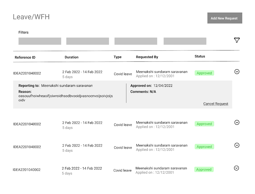
The Call-to-Action (CTA) button is now prioritized to emphasize the core task of the leave application, enhancing its visual hierarchy.
One pain point highlighted by users was the inability to cancel a request after submission in case of plan changes. Adding the 'Cancel Request' option provides users with control and freedom, aligning with the heuristic evaluation of user control and freedom.
Displaying essential information to users while concealing secondary details helps declutter the screen, focusing on crucial content for enhanced user experience.
04 | FINAL THOUGHTS
Next Step
Learnings
Within a limited time frame of the one-day workshop, we progressed the low-fidelity stage of the UCD process. To continue the revamp, I worked on the application using “Appian”, a low code platform and we approached the development team “HUB”,Organization’s management team . Some of the proposed features were executed and the complete revamp is expected to be on the version release of 2024.
In the early stages of my UX career, I gained valuable insights by practicing user interviews with internal members of our organization. This experience bolstered my confidence to engage with stakeholders and real-world users for future projects. Additionally, I acquired the skill of heuristic evaluation for pre-existing applications, transitioning from solely working on new applications to understanding how to approach and assess developed ones.